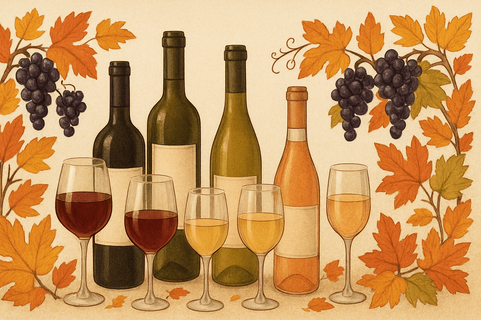
When we decided to create Wine Bounty, one of our first acts was coming up with a great logo. With entertainment and marketing backgrounds, we realized the value in a simple (yet catchy!) design. So, this week we thought it would be fun to highlight some wines that took branding to the next level. While the juice remains the most important factor, a captivating label to ponder or start a conversation makes it all that much more enjoyable. We love out-of-the-box thinking and these wines deliver.
Inkwell Wine
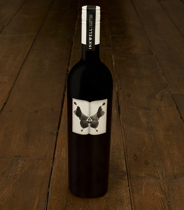
Speaking of conversation, this is a great label to get inside the mind of your companion. According to Inkwell Wine, its Rorschach-like label reflects the idea that “what matters to us is what each person perceives, feels, and thinks when they drink our wines.” Inkwell bottles were featured in the San Francisco Museum of Modern Art’s retrospective “How Wine Became Modern.”
Neil Ashmead GTS
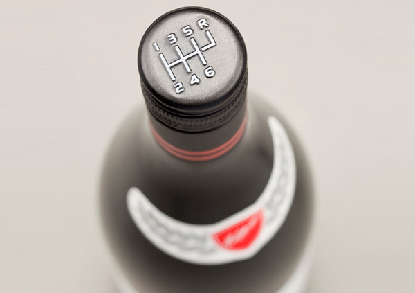
This bottle from Elderton Wines is a tribute to auto (and wine) enthusiast Neil Ashmead. The Neil Ashmead GTS, or “Grand Tourer Shiraz” features a racing-styled label bearing Ashmead’s signature. The bottle’s best design element, however, has got to be its stick shift screw-on cap.
Mini Garage Winery
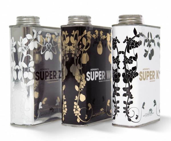
If you don’t accidentally store these wines in your garage, you’re in for a treat. The Mini Garage Wines by Anthony Hammond are literally produced in a former tractor shop in Germany. While the design is unique, we’re skeptical about its ability to cellar so drink up quickly!
Matsu Organic Wine
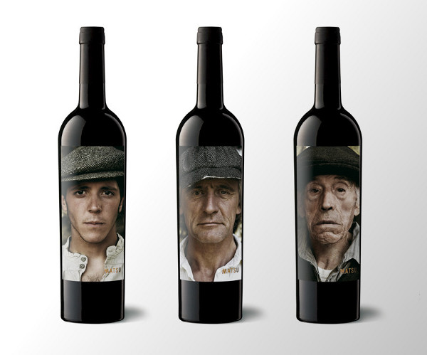
The Matsu Organic Wine bottles show the history of this wine through the generations from grandfather to grandson. Each label represents a different wine from Matsu, “El Pícaro”, “El Recio” and “El Viejo”– each with its own personality and flavor.
Boarding Pass Shiraz
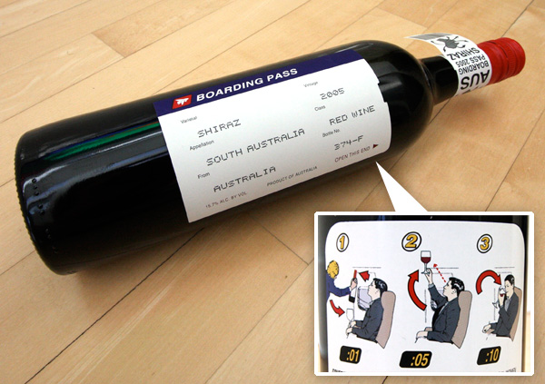
An instant classic, R Wines Boarding Pass Shiraz is one of the most creative theme-based designs. The front label is a boarding pass detailing the wine’s identity which then peels away to uncover the wine “safety instructions.”
USB Port Wine
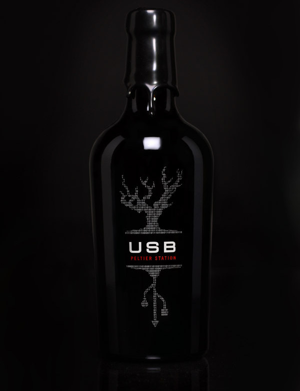
Beginning 10 March 2006, if a “port” didn’t come from Portugal, it couldn’t be called “port” legally. When it came time to release their first port-style wine in 2008, to sidestep this little legality, Peltier Station Winery devised the “USB Port Wine”. The binary code above the name on the front also spells out Peltier Station Winery, completing the look of the design. You go, Peltier. That’s how to “stick” it to the man.
Lazarus Wine
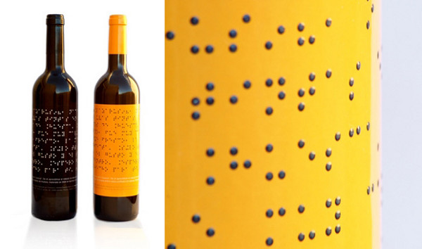
Lazarus Wines is a unique winemaking project in La Rioja, Spain. The wines are produced by blind and highly trained winemakers. The Lazarus Wine bottle features a label printed in big, bold braille with either a black or yellow background. There is an English inscription at its base for those of us who can’t feel what this wine is about.
De Bandera
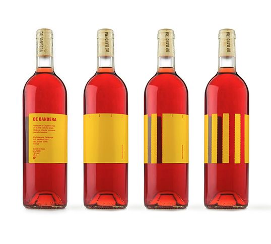
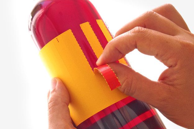
The perforated yellow label of De Bandera wine lets you pull strips away at the Spanish flag and turn it into the regional Catalan flag. This bottle, sold in and around Barcelona (of course), is guaranteed to spark a heated dinnertime debate.
Blossom Cava Sparkling Wine
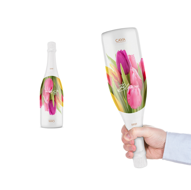
Stella’s Blossom Cava Sparkling Wine found inspiration in trying to do a lot with a little – turning the gift of giving upside down.
B Frank Wine
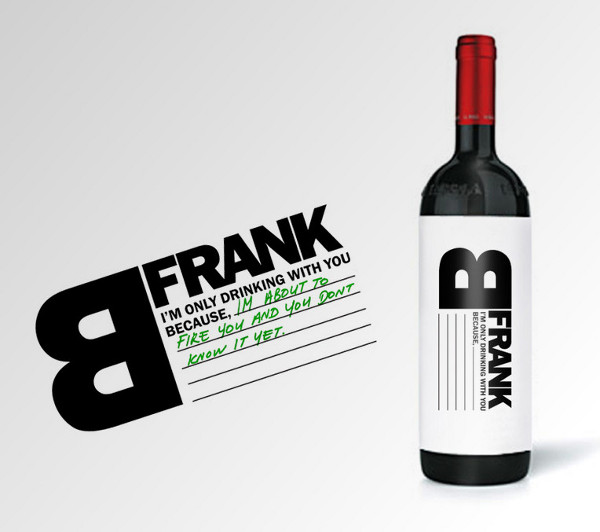
This bottle was designed by Talia Cohen in Canada as promotional advertising for FRANK, but honestly, I can think of a few occasions this would have come in handy.
Luchador
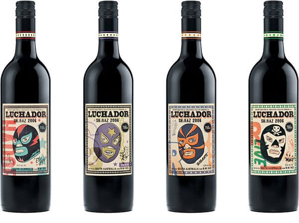
If you liked the Boarding Pass Shiraz, here’s another one from R Wines. The Luchador will bring out that wrestler in us all.
Killibinbin
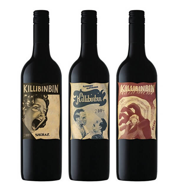
Looking for something to bring to your next horror-themed party? How about one of these collectible bottles that look just like illustrated movie posters from the 1940s. Killibinbin, is literally killing it with these designs. Bravo.
The Wines of Dave Phinney
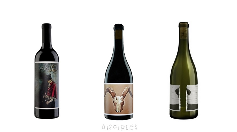
Dave Phinney has something of a cult following and his wines are some of the most hotly anticipated releases each year. Perhaps most well-known for his Prisoner wines, the labels on all his projects share an incredibly unique aesthetic.
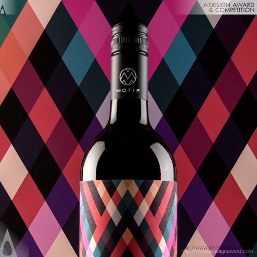
Motif Wine
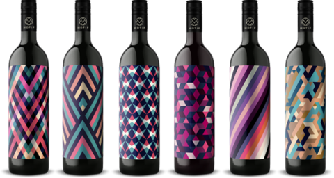
Emblazoned with vibrant, colorful, bold patterns, the Motif Wine collection is ultra-modern, ultra-clean, and eye-catching. While each design is filled with its own unique textile, they are simultaneously minimalist. There is no information about the wine on the front label, piquing your curiosity to step closer.
Finca de la Rica
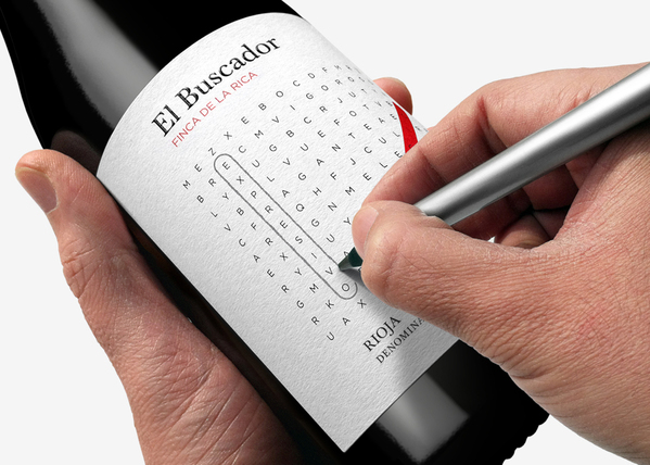
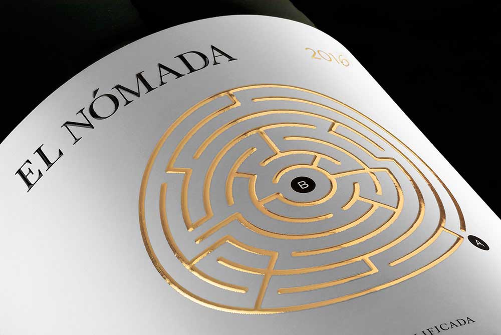
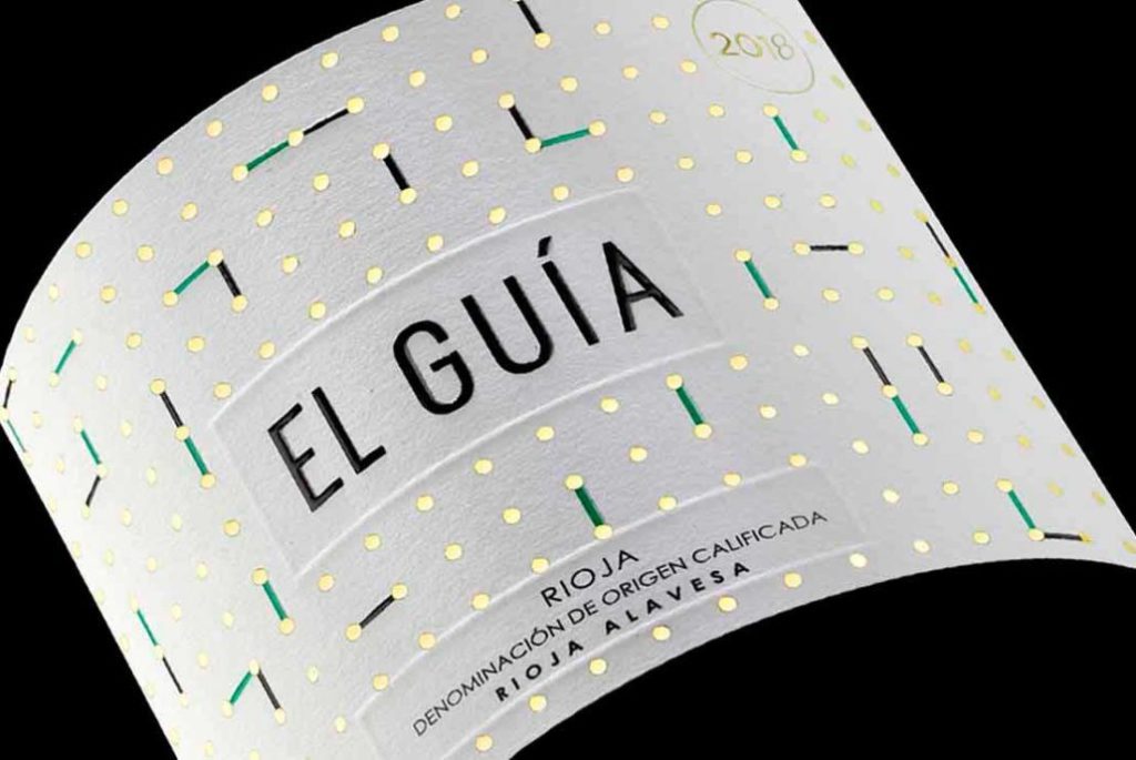
Enjoy games? While then Finca del al Rica is for you. There is literally a game on every bottle. From a word search (hiding the pronounced notes of the wine), to a maze, to a game of Dots and Boxes you can play with your drinking companion.
Perrier-Jouët Belle Epoque
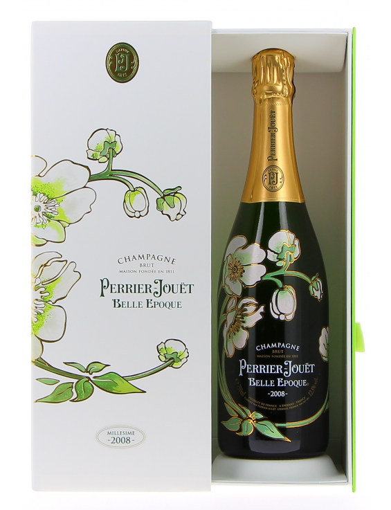
In 1902, artist and glass maker Emile Gallé was tasked with designing a label that represented the recent Art Nouveau movement, welcoming an appreciation for beauty into daily life. Those bottles were ultimately rediscovered in 1964 in the cellars of Perrier-Jouët and the trademark floral design we have come to know was resurrected and sold to the masses in 1969.
Catena Zapata Malbec Argentino
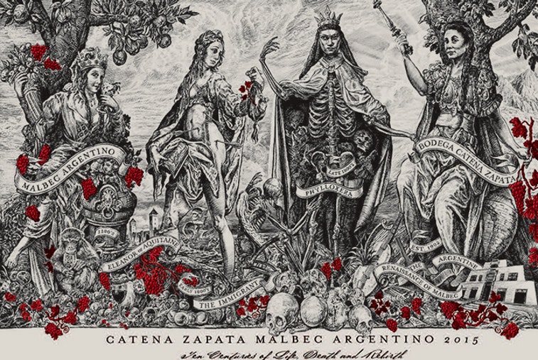
Catena Zapata’s Argentino is a story-telling masterpiece depicting the life, death, and rebirth of the Malbec grape. It features four women who signify a specific period in Malbec history: Eleanor of Aquitaine is first, representing the Old World and the birthplace of Malbec; next is an immigrant, signifying the grape’s arrival to the New World; the third woman represents death (and in particular the insect plague of the 19th century that nearly decimated the grape); and, finally, the fourth woman, Doña Zapata, the Phoenix rising from the ashes to give rebirth to Malbec in Argentina.
Oda Family Winery Ojaleshi
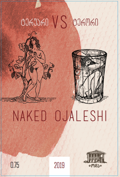
We like a good activist and here’s one label that will be remembered. This Georgian wine depicts two naked women: one free in nature and one caged, which the producer and activist Keto Ninidze describes as the unfortunate, yet still relevant, state of women in society. According to Ninidze, while women are toasted to at Georgian weddings and celebrations, they are far from celebrated in daily life. Above the images are the words “terroir vs. terror”, symbolizing this unfortunate dichotomy.
d’Arenberg
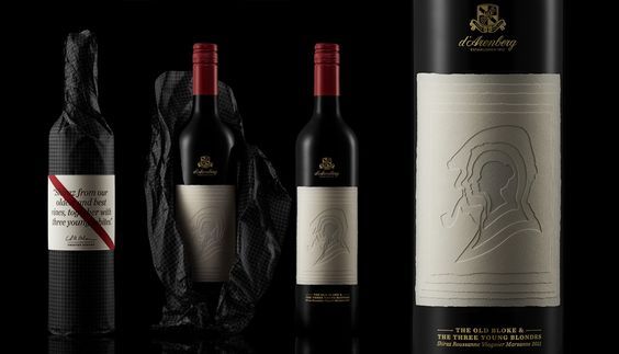
This is an amazing depiction of generations of wine growers. By layering silhouettes on top of each other from youngest to oldest it has turned a complex story into a fairly minimalist and beautiful work of art. d’Arenberg is one of Australia’s oldest and most respected brands with their iconic red sash typically seen across their labels.
The Argonaut
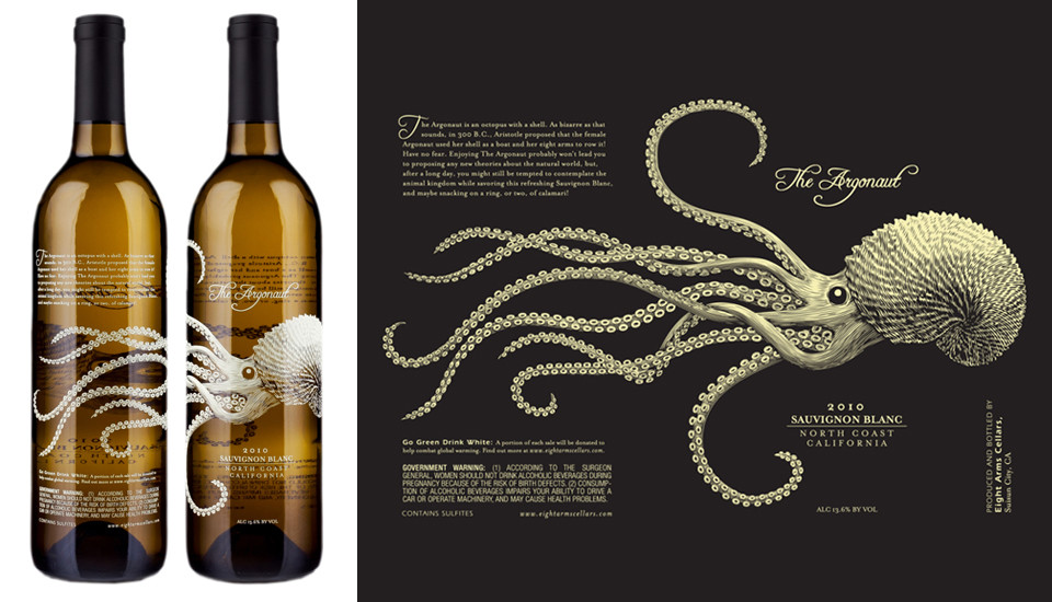
Screen printing offers tremendous flexibility, and the Argonaut is a prime example. The tentacles of the octopus literally wrap the entire bottle, showing through from all sides.
Flight
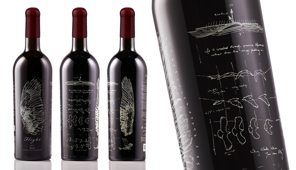
Here’s another screen-print masterpiece depicting one of humankind’s greatest achievements – the study of Flight. The bottle takes you on a blueprint journey from Galileo to Da Vinci to the Wright Brothers.
Antica Terra Wines
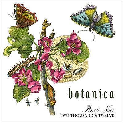
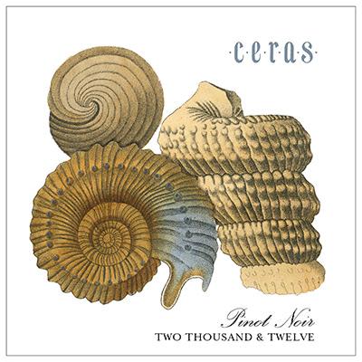
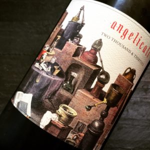
Half of the bottles Antica Terra produces go to Michelin-starred restaurants and the other half go to consumers in their tasting rooms or on their mailing list (which has a lengthy waitlist). If you can get your hands on a bottle, they are beautiful and elegant – each vintage having its own unique image united under each wine’s theme.
Did you like this content? If you did, let us know and share it with your friends.
This page contains affiliate links. We receive a small compensation when you purchase through affiliate links. While clicking these links won’t cost you a cent, it will help us keep the lights on and buy more wine. To find out more, click here.